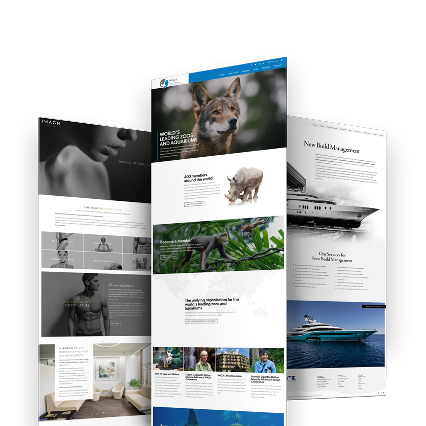
As a freelance web designer, I specialize in developing visually appealing and highly functional websites that assist brands in elevating their online presence. Using a user-centric approach, I design websites that provide an immersive experience for your target audience. Whether you’re a startup or an established brand, I work with you to achieve your unique goals and reflect the essence of your brand.